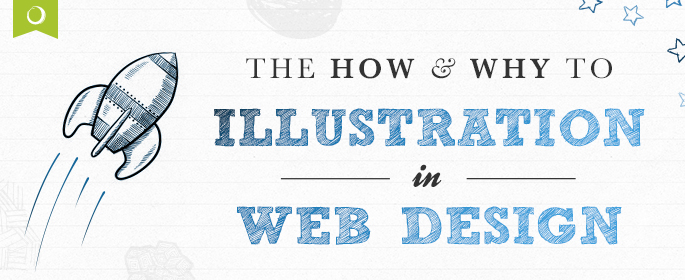
It can be a hard road as an illustrator. Whenever I’m brought into a n argument conversation with a client I’m often not sure whether I should show up with examples or a helmet.
One person in the room is pushing for the use of illustration and has a clear idea of what they want. Another person is squirming in their chair, their mind running on overdrive.
- How will they maintain control?
- Will they have an influence on the look and feel of the work?
- What is this going to cost me?
- Am I going to get in trouble for straying from “the norm”?
A leap of faith is required when choosing illustration and that feels uncomfortable.
This is why so many brands revert to stock photography for their branding. It’s just so easy! You go to a stock photo site and run a search for “woman, yoga, outdoors”, and, instantly, there are 104 lovely, print-quality images to choose from. All brands have to do is add some copy, a logo, and Ka-Pow! It’s ready-made branding.
It looks professional
It’s relatively cheap
You have full control
What’s for lunch? Well, the authority of your brand, for starters.
The ease of stock photography has left our visual landscape saturated with these perfect-world, air-brushed images. Everybody is using the same sources for imagery and that same-ness can render your brand invisible.
Through stock photography, you are paying NOT to be seen.
We know that most people make a judgment about your website in just 10 seconds. The average adult can only read about 50 words in 10 seconds, so photos (or illustration or any other imagery) end up playing a much bigger role than your on-page text or mission statement in determining whether or not visitors will stick around! As Susan noted in her post on logo redesign, your website is the face of your company. The imagery you use should reflect your core message.
This is especially important in an era of increased socialness. Today consumers are trained to sniff out authenticity. We know fake when we see it because it’s everywhere. If a company shows photos of actual employees, facilities, etc., that’s a big improvement and it’s something we remember and take note of. It’s more authentic and more engaging.
That flawless, perky woman in the headset grinning on your homepage?
Sure, she may look okay. But she does not work in your business. You know it, and your audience knows it. Trying to make them believe she does hits at your credibility and detracts from the message you’re trying to convey.
By replacing stock photography with illustration you’re showing customers what you feel, what you believe, and what you live. That’s authentic. That’s truth.
Below are five reasons your brand should consider illustration and get off the stock photography train.
Five Reasons Your Brand Needs Illustration
1. It’s unique and customized
How many times have you landed on a new website and instantly recognized the images staring back at you? The fake handshakes? The fake business meetings? We’ve all seen them. Is that really how you want to represent your brand?
One benefit of illustration is that it’s customized and personalized for your brand. It allows you to combine your message, your service, and your people with a fresh, one-of-a-kind image that renders your brand unmistakable. If your branding is designed to use the same images everyone else is using, you’re doing branding wrong.

2. It’s more fun
Have you taken a look at some of the illustration work out there? It’s giving brands license to represent themselves, their services, and their message in fun, attention-grabbing ways.
If you haven’t sought it out, there is some amazing commercial art out there. Below is an example of how Aggregift uses illustration to convey their message. Last year, The Next Web also compiled a list of 14 awesome examples of illustration in web design. It’s proof that just because you choose illustration doesn’t mean it has to be cartoony or unsophisticated.

3. It engages
Whereas stock photos leave consumers bored to tears, well-craft illustration grabs eyeballs every time. At Overit, we’re even fond of going one step further and making illustration interactive. We’ve found the combination of illustrated imagery and motion entices customers to stay on a website and dig deeper into what you have to offer. And, of course, blow their socks off with that interactive infographic, map or character and they may even send the link to their buddies. 😉

4. It’s inviting
Illustration can break a lot of barriers. The first being reality. You can distort perspective or do away with it altogether. You can make the sky yellow. Combine photography with line drawing. Your brand can be,its own place. Its own planet. its own reality.
When you combine this with your logo, typography and most importantly, your message- your brand will stand apart like it never could with stock photography.

5. More focused messaging
They say a picture is worth a thousand words and that’s certainly true when it comes to good illustration. The right image can help brands simplify and fine tune their messaging. From charts, diagrams, maps and more, a good illustrator can clarify your message and make it clean and engaging for someone to understand.

When you’re heading down the road of illustration, make sure to give some thought as to what you want to build and the experience path you want to send customers down. Don’t hire an illustrator to recreate something you’ve already seen or to go on a wild goose chase after a vague idea you can’t quite verbalize. That defeats the whole purpose!. It’s smart to bring ideas to the table: magazine clippings, websites that you like etc. Anything that will help drive the conversation is good- especially true if you don’t have an art background and have trouble explaining visual ideas.
But, allow the illustrator room to create.
The truth is, many of the fears brands have about illustration (no control! Too expensive! Too out-there!) are actually solved by using illustration over more generic forms of imagery. A good illustrator is a good listener and interpreter. You tell them the message you’re looking to convey and what you want your consumers to feel and you’d be surprised. They may be able to create something you never would have pictured on your own.


