A bit of a caveat is in order first, I believe. In this article, I am not professing in any way that this way is the best way, but simply that this is “a single front-end developers” way. Also, you should know that the tools I’m using and will be referencing in this article specifically, are (in no particular order) – pen, paper, Photoshop, Textmate and Chrome (all run on a Mac). Shall we begin?
Like MacGyver
Since I can remember, I’ve been taking things apart and trying to put them back together (I’m sure, much to my parent’s and older brother’s chagrin). It was only a natural progression for me to eventually try my ability at recreating various “trinkets” with found objects… ya know? Kinda like MacGyver would.
Fast forward a few years and I’m still essentially doing that same thing at my job. I am tasked with taking a designers visual representation of a website, application or whatever – and then making it function… complete with moving parts and/or dynamite (not really). And, I can honestly say that the first “exciting” moment for me is when I save the first image (usually the bg-html.jpg).
Pieces Everywhere
If you were to look at my image directory for any given project, it’d most likely resemble a graveyard of a once cohesive, beautiful design. UI (user-interface) pieces here and there… buttons, background images and seemingly random blocks of text. All of these elements represented in one of three formats; jpg’s, gif’s and png’s.
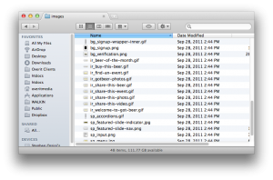 Typically, I will follow these simple rules:
- keep file sizes under 60k
- group sprite sheets based on their function
- buttons
- form elements
- location-specific backgrounds
- keep a consistent naming scheme (e.g. TYPE-LOCATION-DESCRIPTOR.EXT)
- bg-navigation-tiling.gif (bg = background)
- ir-fancy_text_style.jpg (ir = image replacement)
- sp-contact-form.png (sp = sprite)
- isolate by naming or directory, any images the are FPO (for placement only)
Cart Before the Horse Much?
Well, sure… but with reason. Now that you have a picture of where I’m heading, I’ll tell you the how and why.
The How Part
This is always in a state of flux, but it typically goes something like this…
- Make a rough drawing of the page you’re about to mangle explodecreate the web optimized graphics for.
- Draw boxes around the content areas (defining these and making sure your markup is completely semantic is a whole other article… or series of articles that is).
- Identify where you can leverage tiling background images… usually I will indicate this with large boxes around these sections.
- Label UI elements (if there are a lot, then you may want to break these up into sections, based on the content block or other factors).
- Label any static text that needs to be addressed as an image.
- Now – open your PSD (Photoshop document) if not already open, and begin to extract your images. A little side note to the Graphic Designers – if you keep a tidy PSD, us Developers will be your BFF. Not sure if your PSD is tidy? Use this site as a benchmark: Photoshop Etiquette
How I “extract” the Graphics
Again, always in a state of flux… but these are the most common methods that I employ…
- The “Copy Selected Area” or CMD+Shift+C method:
- Isolate (either by hiding layers / or shifting your selection area)
- Select the area with the marquee tool (keyboard shortcut “m”) – Note: this can be a rough, since we’ll clean it up in the new document we’ll be creating
- CMD+Shift+C to copy selected area (this is also an option in the “Select” menu if you are apposed to using keyboard shortcuts?!)
- Create a New Document (CMD+N) – Note: you can opt to name the document to reflect the name of the image you’re creating in this dialog box
- Paste your copied selection (CMD+P)
- Adjust your canvas if needed (CMD+Option+C)
- Save for Web Devices (CMD+Option+Shift+S) in the format that best suits the image
- The “Slice and Cut” method:
- Using the Slice Tool (keyboard shortcut “c”), draw your boxes around the areas you want to save
- Using the Slice Selection Tool (toggle the various slice tools by holding “Shift+c”), double click on your selections to refine the size, as well as the name of the slice.
- Isolate as many of the slices as you can.
- Save for Web – Note: in the save for web dialog box, you can select your slices to determine the proper format for each slice (keep in mind the Simple Rules)
- Repeat steps 2.3 and 2.4 as many times as needed.
Sprite is Not Just a Tasty Beverage
Using the previous extraction methods and/or dragging entire layer groups into new documents, you can create a sprite sheet for elements that have multiples states (like buttons) or UI elements (like form elements… text areas, input fields etc.), or elements that only have one state; tiling or not.
Sprite Tips and Tricks
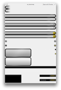 Keep in mind the white space in the sprite sheet in relation to the alignment of the sprite within it’s container (in the markup itself). It is frustrating to find other sprite sections creeping into a container that is larger than the sprite area you want to display. So, when creating sprite sheets, I try to keep in mind the following:
- Does the image need to tile, and if so, on what axis?
- Will the container be a fluid height and width?
- If the image is left aligned in a fluid width container, then I want the image to be right aligned on my sprite sheet.
- If the image is right aligned in a fluid width container, then I want the image to be left aligned on my sprite sheet.
- If the image is top aligned in a fluid height container, then I want the image to be bottom aligned on my sprite sheet.
- See a pattern?
- Do yourself a favor…
- If you can, space elements in consistent increments so figuring out your background-positioning is going to be more manageable. – example: Resting State = 0px 0px; Hover State = 0px -50px; Active State = 0px -100px
The Why Part
All things should be done with purpose – my goal is always to have an explicit reason for doing what I do, otherwise I find that the end product may end up closely resembling one of my first “creations”. Ya know… one of those ceramic, bowl shaped, ashtray-mugs that inevitably end up in the family garage sale?
- File size – images should be no larger than 60k if it can be helped… simple, the smaller the file, the shorter the load time.
- Grouping by Function – this helps if you want to apply a background image to all elements with a class of say “button” – very practical and makes for a more efficient deployment of your image assets.
- Naming Scheme – you can easily have upwards of fifty (50) or more image files, so it’s another way of establishing a predictable order. As well, it’s nice to be able to tell exactly what the image file contains by looking at its name.
That’s How I Do… How do You Do?
Although the principals don’t change much, I’m constantly refining my approach by leveraging the tools available, or by repurposing other tools and ideas. I also look to the development community as well as my co-conspirators on the production floor for inspiration and ideas. I also should let you know that before even opening Photoshop, I open Textmate and create the basic markup (containers) for the content to be produced. Again, this is a whole other article… but I will say that by doing this first, I find that it is easier to focus on the semantics, and the end product is more streamlined.
So… how do you create your web optimized graphics? Do you have any suggestions on how I might improve upon my outline here?
