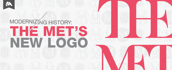
Last week, The Metropolitan Museum of Art unveiled its new logo that was promptly met with an onslaught of opinions and feedback from designers and the museum’s patrons. The design community is historically notorious for visceral reactions to rebranding efforts, and the reaction to The Met’s logo unveiling was no different.

While many designers and pundits react to the logo itself, I think it is important to consider the entire rebrand of The Met that has been under development since its current director, Thomas P. Campbell, took on his leadership role, and withhold final judgement until the entire brand is rolled out. It should be judged in the context of the full experience and not just on a piece of typography.
Rebranding is a process reached through various avenues and has to take a number of different perspectives into consideration. When historical institutions in particular want to rebrand, the process can often be more difficult because they are steeped in history while trying to stay relevant and new. People are often afraid of (and upset by) change. The public eye is on such institutions, like universities, museums and libraries, and the reactions can be emotional because of the personal connections with the brand. The fact that this museum in particular houses works of art that range from ancient times to modern society, creates a challenge for any agency. It is itself a piece of history.
The Met’s recent logo has been in use since 1971, and was featured for decades on The Met’s famous admission button. As a result, the logo has become visually tied to the museum and long time visitors who identify with it.

The current logo comes from a woodcut by Luca Pacioli, a collaborator of Leonardo da Vinci’s, and the museum has this wood cutting in its collection. Taking design cues from source material is a great design strategy, however the design was not meant to be used as a logo, and has some inherent problems. Historically, it has been quite difficult to reproduce reliably across various media. It also doesn’t scale particularly well. Some would also argue the logo relies too heavily on symbolism. The Met has gone through numerous rebranding efforts in the past. All previous logos shared common elements, specifically a lone capital ‘M,’ which makes this current logo much more of a departure.
It’s important to keep in mind that the purpose of a rebrand is to create a new, more unified appearance, and to make a promise to patrons who will embrace and act upon it. Within a New York Times interview, Campbell notes that The Met’s audience has increasingly gone digital. He says, “The exciting thing is that because of technology we’re reaching out to new audiences. Our attendance has increased from 4.5 million to 6 million over five years. But online last year we had 44 to 45 million visitors to the website.”
Audiences change, and each new generation of viewers is different. Their expectations and desires on how they experience and understand the world around them is different. By ignoring that fact, you run the unavoidable risk of excluding certain demographics. However, it’s important to also not exclude your current audience. This is a great challenge that any brand redesign faces.
The brand consultancy hired to create The Met’s new logo, Wolff Olins, is no stranger to controversial design. They rolled out the logo for the 2012 Summer Olympic Games in London, which received a mixed reception among the design community. Initial reactions were overly harsh, while over time it’s still quite difficult to judge its success.

Oddly enough, the contention laid around the use of typography. The logo’s design breaks many typographical rules and expectations. In terms of the typography and technical structure of The Met’s new logo, Wolff Olins attempted to identify shared typographical elements in the glyphs and eliminate or combine any redundancies.
- Notice that the serifs of the ‘T’ and ‘E’ are angled, which creates a set of non-complementary angles and a slight “bulge.” The tie of the ‘E’ is also set to an odd angle that disrupts the balance of white space inside and surrounding the glyph.
- The foot serif of the ‘T’s are cut off abruptly as a sacrifice for combining glyphs.
- The stacked presentation of the words creates gap where the diagonal strokes of the ‘M’ open up and base of the ‘T’ rest. The hairline strokes are very light and creates a large amount of contrast. This creates a visual hole and makes the entire piece feel lopsided.
- The emphasis on “THE” seems somewhat jarring and over-emphasized, however the museum is lovingly referred to as “The Met,” so the abbreviation makes sense in response to the community.
Sometimes harsh responses to rebranding efforts can stifle designers’ creativity, create artificial boundaries and lead to a more homogenous, and in the end, a less creative industry. Designers are taught basic rules. Then, as we grow, we begin to intelligently break those rules to achieve a desired result. It’s in breaking the rules that design evolves, and new and amazing pieces are created.
To bring in a new and contemporary spin to The Met’s visual brand, Wolff Olins had to include a nod to the past with a new twist and break those design rules. The Met’s new mark does that. The route of the typographic letterforms is classic, and how they have been constructed and how they interact is a modern spin, all judgements aside.

As a designer, I applaud this effort. It takes guts. With this new logo, The Met has reacted to growing demographics, and has truly listened and cared about its audience. The merits of the design itself aside – Wolff Olins has the public talking about The Met. They’ve created a reaction and conversation that many brands – good or bad fail to achieve. Cheers to looking towards the future and moving an iconic institution forward – and to making history.

