5 Distinct Locations. One Unique Brand.
A Site of Olympic Proportions
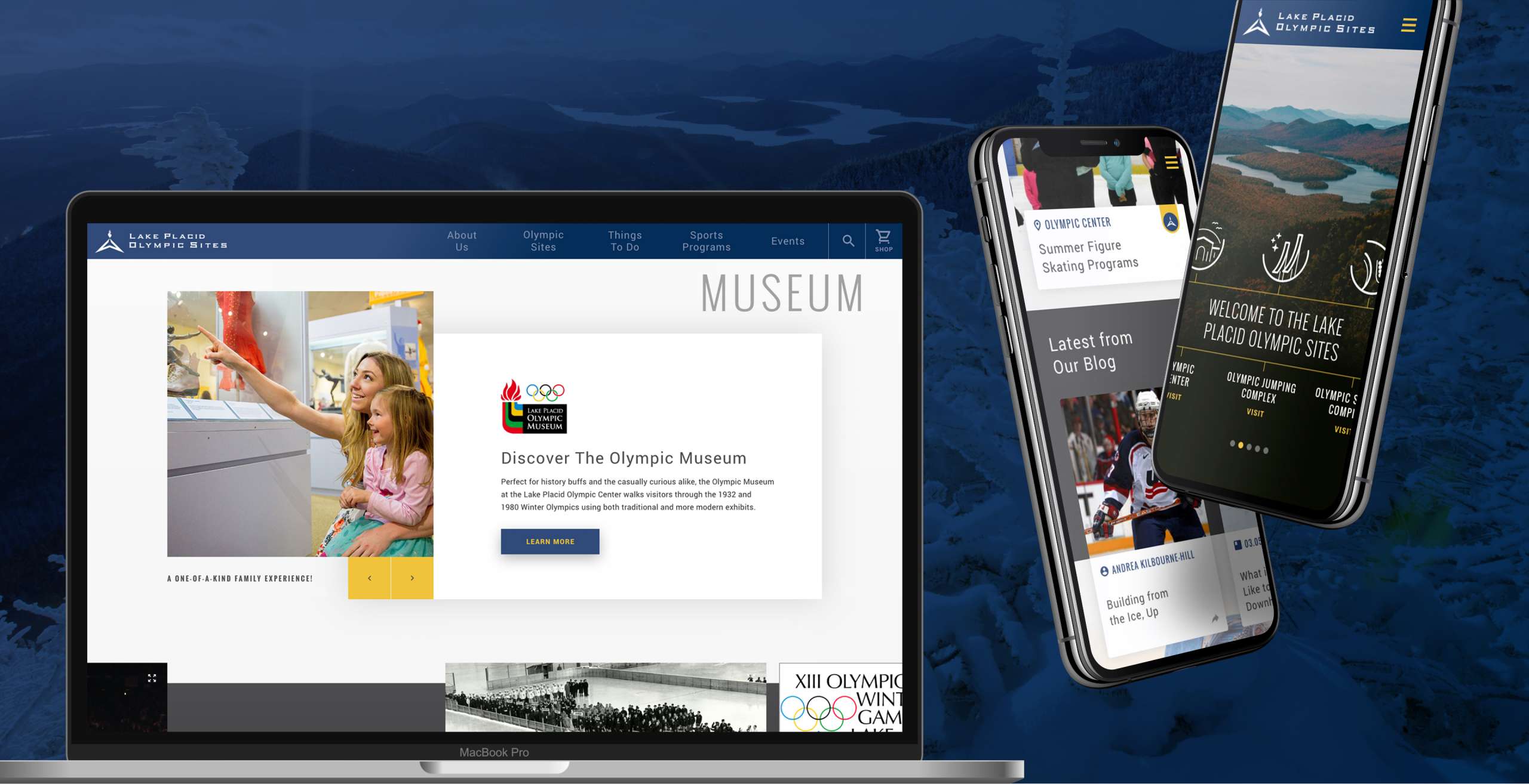
Overit was approached by the New York State Olympic Regional Development Authority (ORDA) with one mammoth task in mind: take the Lake Placid Olympic Sites (LPOS) brand, spread out across a number of different websites, and consolidate them into one master site to streamline the brand and create a one-of-a-kind, easy-to-navigate user experience.

Crystallizing the Brand Web
The Lake Placid Olympic Sites are a chain of interconnected landmark locations nestled in the Adirondack Mountains with- as their namesake implies- an Olympic legacy. As the home of both the 1932 and 1980 Winter Olympics, LPOS has a stellar reputation as a must-see location because of its triad of experiences: exceptional natural beauty, deep historical gravitas, and winter sport activities that make it a thrill-seekers paradise.
These experiences are spread out across five distinct locations: the Olympic Center, the Olympic Jumping Complex, the Olympic Sports Complex, Mt. Van Hoevenberg and Whiteface Mountain. Despite the clear in-person unity of these five locations, ORDA felt that it was lacking a distinct website that communicated each of these places as one distinct LPOS brand to users.
Overit got to work collecting background information on the Olympic Sites to begin constructing a rock-solid brand that could communicate this unified message in one tight package. First steps were stitching together a picture of what the core of LPOS was to its stakeholders. This meant parsing knowledge and assets from a diverse internal team, understanding the wants and needs of external leadership, and drilling down on what guests believed made the Lake Placid Olympic Sites so special.
Upon the completion of research, a clear vision took shape of what a new LPOS website would look like, drawing on the diverse interests of stakeholders and the diverse experiences of each location. The Overit team dubbed it, “The Card System.”
A Strategy Rooted in Communication
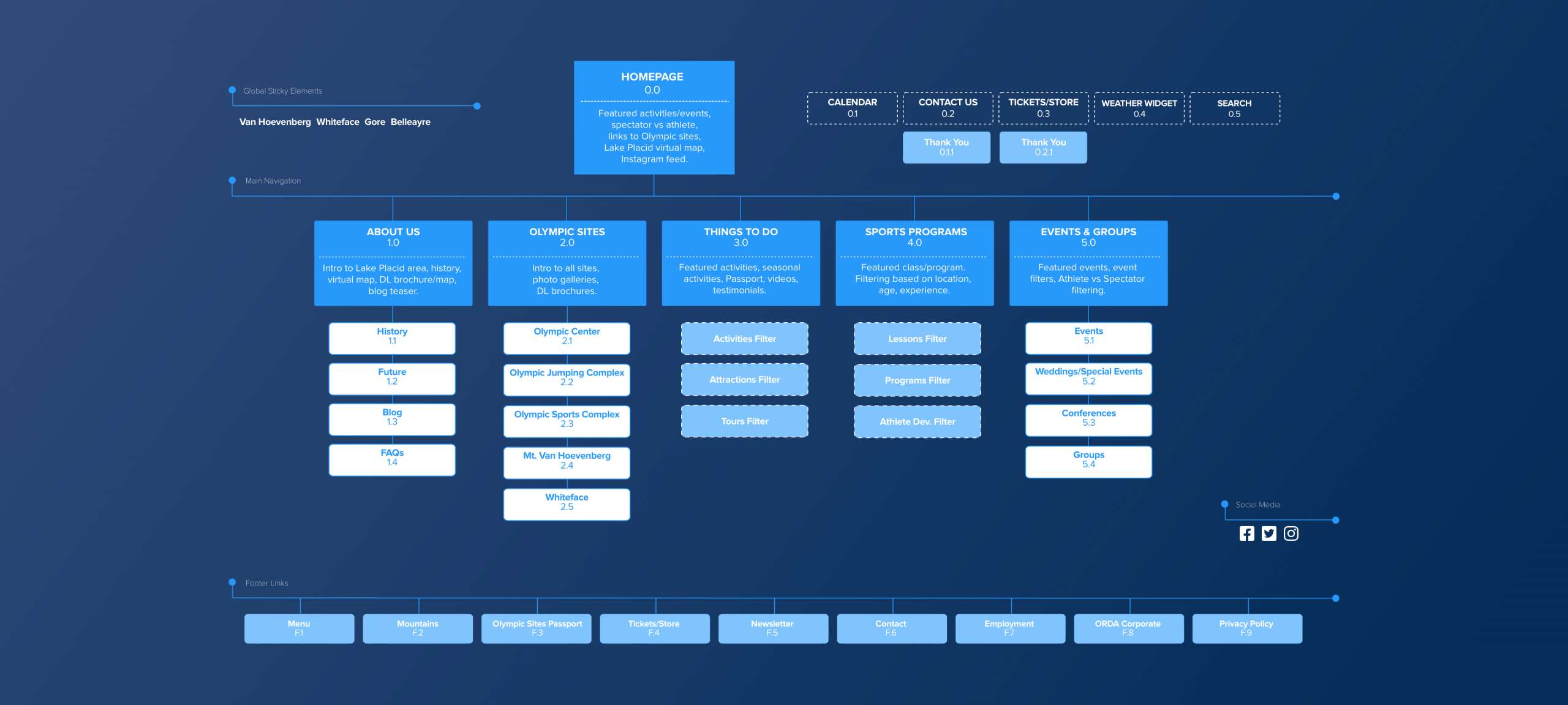
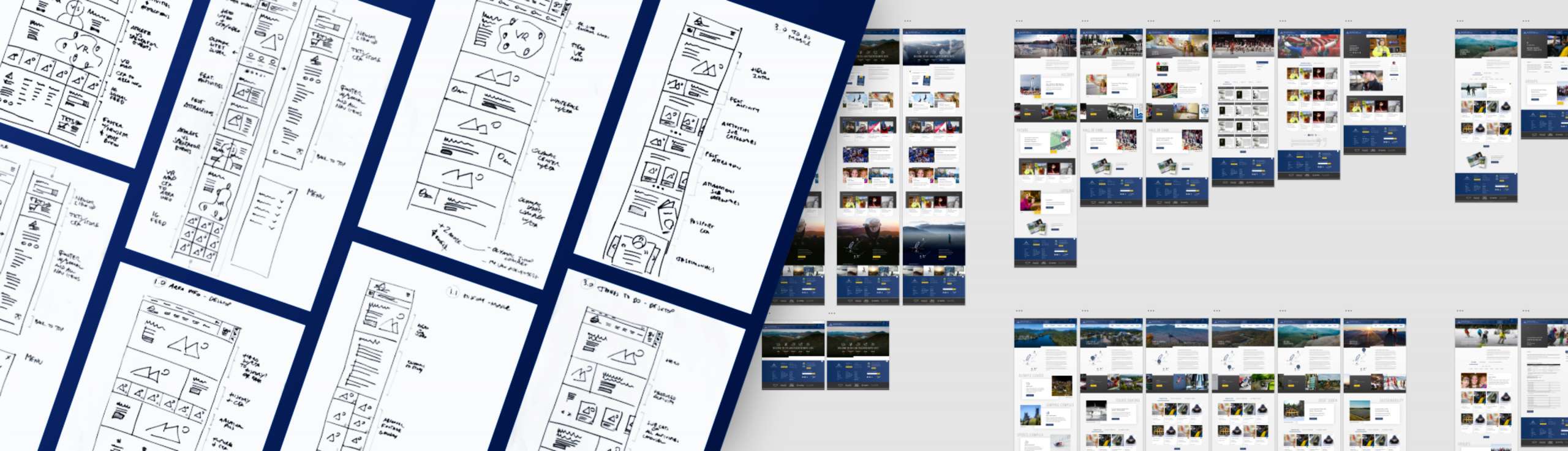
With a base concept established, Overit’s design team got to work on building out the look and feel of the LPOS website with two foundational beliefs driving the project’s philosophy: a simple, intuitive user experience (UX) was absolutely vital, and ever-present communication with the LPOS team was key. With these base ideologies behind the wheel, Overit got to building a sitemap and wireframe–a sort of “rough draft” of what a website will look like navigationally to a user.
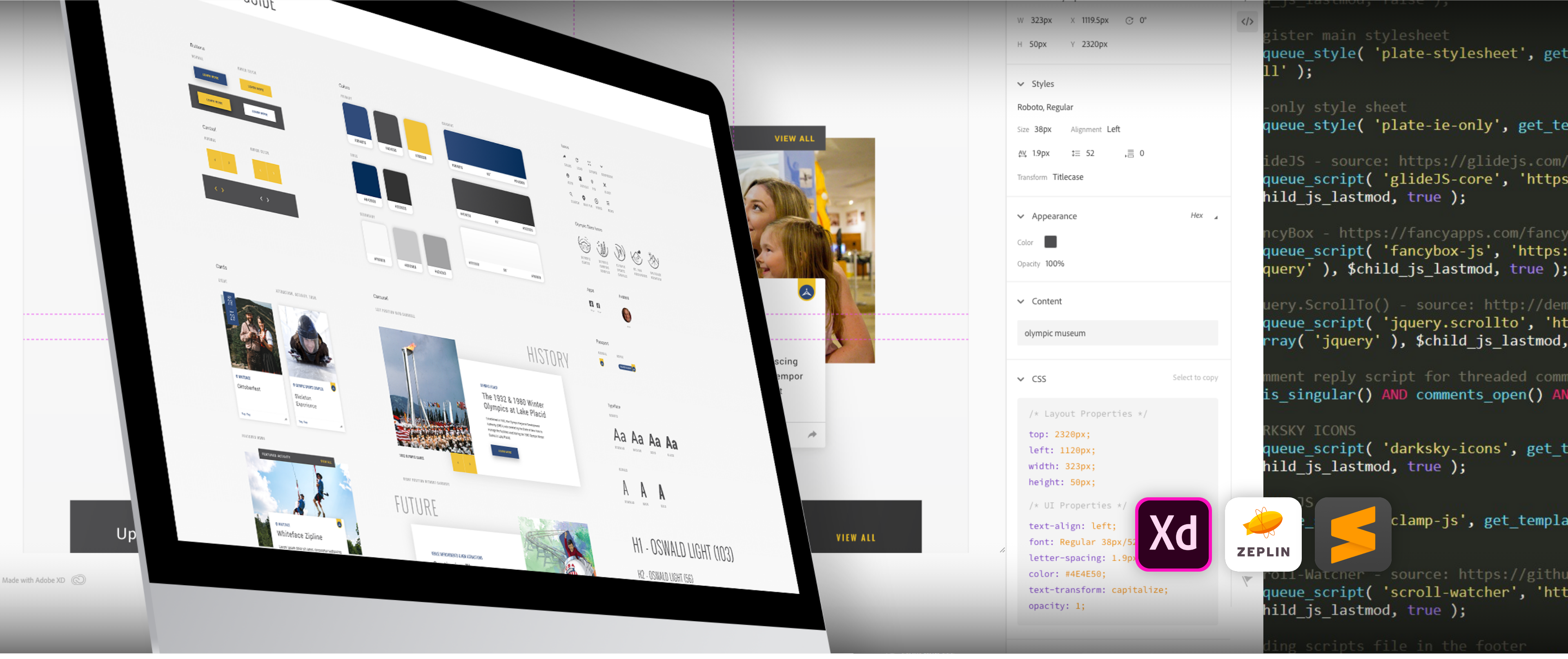
Site Mapping started as a rough, marker drawn outline on a whiteboard, moving to hand-drawn sketches, and ultimately evolving into a digitally designed map that could easily be adjusted and remolded when needed. As the skeleton of the site started to take form, Overit included the LPOS team in the process in an essentially instantaneous fashion, using sharable Adobe XD files to allow them to view design and UX decisions in real-time; this allowed for a seamless back and forth that both bolstered communication and made project progress highly efficient.
Enter the “Card System”: Overit’s design team used a series of modules- nicknamed cards- to streamline the user experience and keep design elements looking simple, easy and clean to make site navigation both concise and intuitive.
It also allowed for content to be pulled from the numerous other sources that populated the LPOS web- the websites of the other Olympic sites- and compact them into easily digestible, clearly communicated blocks. It was an approach allowing for both sweeping consolidation and simple, stylish design and UX.
Keep the most pertinent information for the user as close to the top of the page as possible to limit scroll, intuitively present the user with a quick route to their goal, and collaborate with the client in real-time: those were the underlying goals going in, and the Card System facilitated those goals.
Building On an Ambitious Vision
To deploy the principles of UX and the visual flair built by the design team, it required a development team deeply in tune with both the designers and the client. The Overit team was prepared. Building on some of the skills and experience from previous work, our developers were able to turn the front-end vision into a backend reality. Because of the ever-changing nature of activities and events at the Lake Placid Olympic Sites themselves, it was Integral to build a flexible site.
Dynamic structure within WordPress allowed the ORDA and Overit teams to easily make content edits, shuffle cards, and generate aesthetically pleasing visual blocks without a huge learning curve offering significant value in the long-term.
We also needed to think ahead. As the consolidated LPOS website was just phase one of a larger project, it was extremely important that the coding established in this first phase was malleable enough to be integrated into future phases. This meant tirelessly working to create something that would be deeply ingrained in the entirety of a long-term project, while also creating a custom-coded events calendar that pulled information from every Olympic Site, for every event and activity, every single day. It was a heavy lift, but as one designer put it:
“On a personal level, Lake Placid is a place close to the heart. We are huge winter sports fans in my family- we adore Lake Placid- and having that opportunity to work on something so close to home and something you care about is a huge motivator.” Passion, teamwork–and of course great code. It was a recipe for success.