The Upgrade Of The Century
Sparking a new brand for a well-loved energy systems company.
Trojan Energy Systems came to Overit seeking a boldly creative marketing firm to advance its brand and create a sophisticated website that would help them connect more deeply with their clients.
How It All Began
Nobody knows more about boilers than Glenn, founder of Trojan Energy Systems in Troy. For nearly 30 years, he’d established himself, and his company, as experts in boiler installation, repair, and engineering. Servicing all of New York, much of Massachusetts and Vermont, and several areas around the country, Trojan already had a tremendous reputation in its industry.
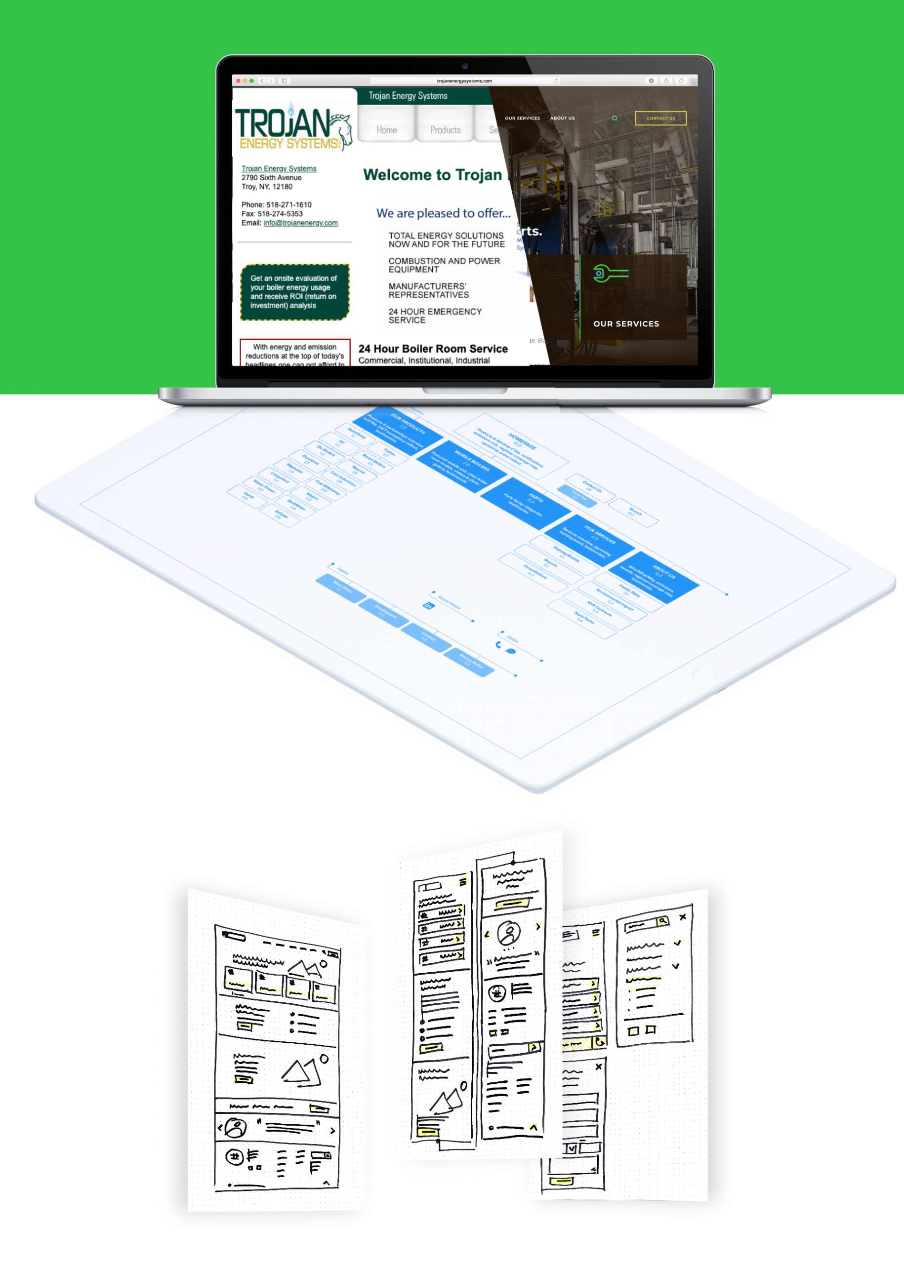
But this company that started in 1991 had a website and logo that matched its vintage, and they were eager for an update. Through research and interviews with many of Trojan’s employees, we were able to develop a logo that resonated with the Trojan team, messaging that spoke clearly to their market about what they do, and a website that made important information easily accessible, especially for middle-of-the-night boiler emergencies that require specific and sometimes hard-to-find parts that Trojan just happens to have in stock.
Making of the New Trojan Logo
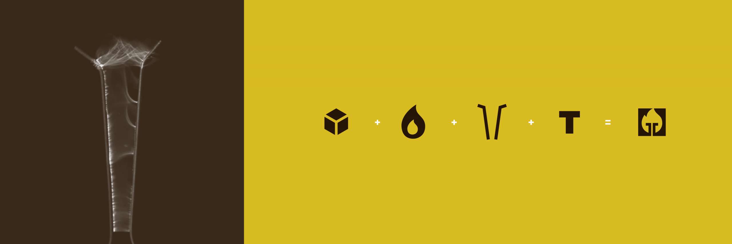
With a clarified mission and vision for the future, Trojan needed a logo to match. We recommended a major logo overhaul — an intimidating prospect Trojan was game for. We set out to capture who Trojan is and what tenets were most important to the brand: expertise, environmental consciousness, reliability, and education. Before we began creating a new mark, we took a close look at the logo Trojan already had: an image of the famed Trojan horse, a pilot light to represent energy, a bold, assertive font to reinforce the strength of their service and their brand. It was important to everyone that the new logo retain the equity of Trojan’s decades in the market while moving in an exciting new direction.
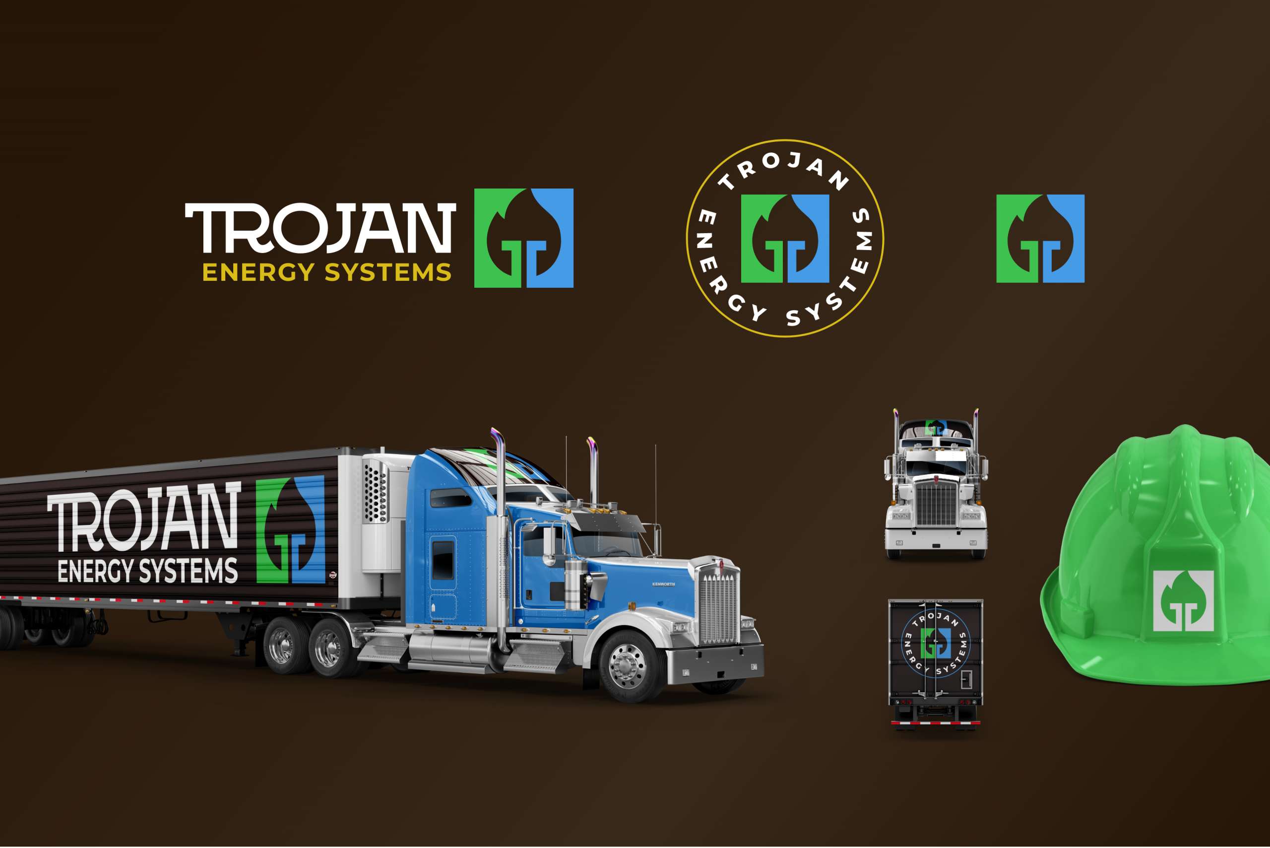
The final product was something that both Overit and Trojan fell in love with: We maximized the flame, made it more realistic, and added a suggestion of an ignitor. We brought forward the green color Trojan was using and grounded it with a dark, earthen brown to underscore their commitment to environmentalism and cutting emissions. We deployed a customized slab-serif font to lightly modify the font Trojan was using already for its name. The biggest change of all? We retired the horse from the logo to break from competing logos — after all, the city of Troy is home to many businesses calling upon the story of the Trojan horse in their branding.
Reigniting The Website
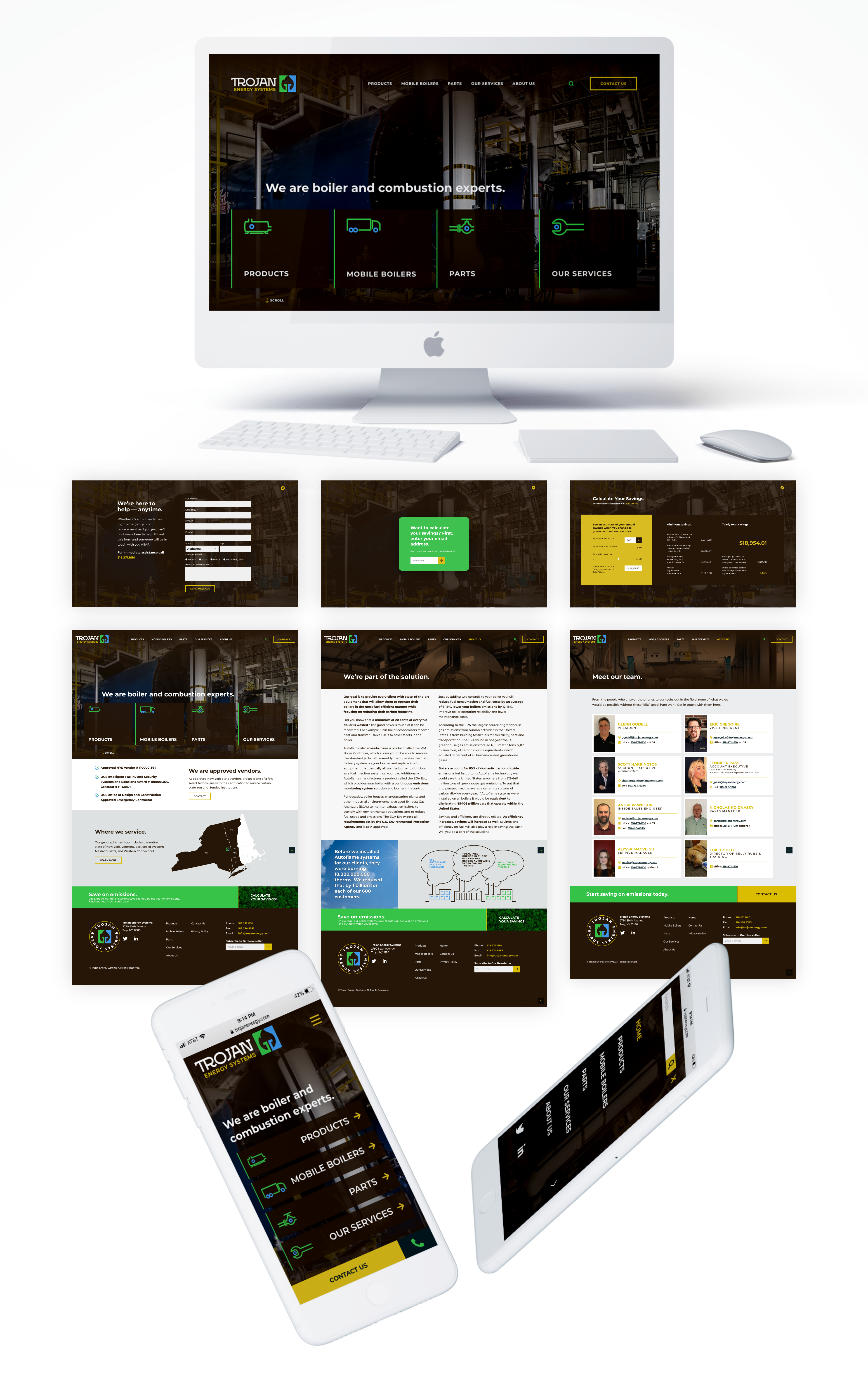
As with most good businesses, Trojan Energy Systems had many services to offer. Their challenge was choosing which they wanted to center on their site.
Their rollout of a new and exciting product made it an easy place to start. We went for a clean, clear design that directed customers to a controlled set of options. We made the new product — and their other priority services — front and center in order to make the site navigation and user experience functional and pleasurable. Where Trojan’s previous site was challenged by small font sizes and an overabundance of text, we built a responsive site with bold headlines and succinct messaging to send a clear message of expertise and trustworthiness.