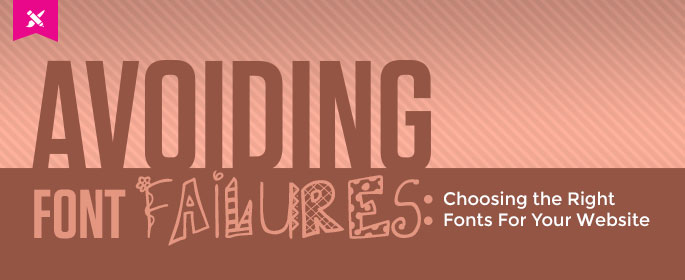
In print and online, typography is expressive, just as much as (or sometimes more than!) imagery. The right choice of fonts for your website can reflect the voice and tone necessary to tell your story, while the wrong choice can garble your message. Your fonts can grab readers’ attention, or turn them away before they get through a complete sentence.
There are a number of things to consider when selecting a font for your website.
Know Your Audience’s Legibility Needs And Attitudes
Knowing your audience is critical to any marketing effort, and it remains important when choosing the fonts for your website, as well.
Does your audience consist of an older population? You may choose a simpler typeface set at a larger than usual size (a recommended industry standard is 16 pixels for body copy). Is your audience short on time and quick to make decisions? You want a font set for easily-read calls to action that imply a sense of urgency.
And, more and more important every day now, what devices are members of your target demographic using? Reading on a desktop can be a very different experience than reading the same copy on a small mobile device or mid-sized tablet. While you should take your audience’s preferences in consideration, you typically don’t need to use different fonts for different devices. You may decide how fonts scale at different breakouts, or simply know you need to prioritize font choice based on the most critical user experience.
What do we mean by attitudes? Identify what your audience reacts to. Do your research to see if they’re turned off by gimmicky (or overly salesy) uses of typefaces. See if they tend to click whatever big shiny button (call to action) comes first, or if they’re thorough readers likely to consume as much information as possible before making a decision. These trends will guide your messaging and which fonts you will choose to communicate those messages.
Know The Voice And Tone With Which You Wish To Communicate
As you’re identifying your audience, you also must identify your goals. How do you want people to feel when reading your content? What emotions do you want to create? Excitement? Peace? Urgency? And, how do you want to portray your brand? Technically-savvy? High class, elegant, sophisticated? Casual and fun? Serious? Identify and claim your brand voice.
If I’m selling high-end quality home decor and I use a typeface for the headlines that looks like it’s for a children’s book or a hard-core metal band would use on a poster, that is instantly going to affect how a person perceives you and the product.

If you want to appear CONFIDENT, you may choose something heavy, bold and in all capital letters. If you’re communicating something sentimental, you may choose a script font. Your choice of typeface dictates your tone tremendously.
Maintain Brand Consistency While Choosing Web-Ready Fonts
Quite often, the fonts brands have used in their print materials for years are not fonts effective on the web. Although there are more resources for integrating typefaces on the web, many of the classic typefaces used in print have licensing restrictions and compatibility issues that prevent their use. They also may not be optimized for on-screen, or simply not recognized by search engines, limiting their ability to “read” your website. This, as you can imagine, is a dangerous issue.
With the assistance of a designer who has an eye for the nuances of typography, you can find web-ready fonts with typefaces comparable to what your brand has historically used. Your designer will help find font sets with similar weights and architectural builds of the letterforms. If your brand always uses either a serif or a san serif typeface, you won’t want to go online using something completely different. You may unintentionally communicate different tones in print and online, leading to inconsistency in how the brand is represented.
You and your designer do have to be a little bit skeptical. Just because they’re “web-ready” fonts does not mean they’re well constructed typefaces. There might be something favorable about the letterforms, but if it wasn’t built with good kerning and you don’t have the ability to alter that to the same degree as with print applications, it’s ultimately going to have a poor appearance. Your designer’s eye should be able to distinguish the good fonts from the bad.
If you feel you can’t find a web font that is similar to your print type, the best solution is to go very generic (such as Helvetica), because it is fairly neutral in tone.
Mix It Up!
Don’t be afraid to use different fonts for body copy, navigation, major calls to action and other copy elements on your site. An effective way to communicate different messages, or levels of emphasis, could very well be different typefaces. Now, you don’t want to use a different font everywhere you look, but the letterforms you use in your navigation may be a much simpler style than your headlines or calls to action. That’s ok! Use different ways to express different information.
Grab and Keep Your Reader’s Attention
When choosing a font, it’s important to choose it for legibility purposes first and foremost. Some are tremendously more readable than others. Some work great in a five-word headline but not for large blocks of copy.
When you use a font that is hard to read, you run the risk of losing the users engagement level. If you have eight to ten seconds to capture a visitor’s attention and encourage them to stay on your site longer, you don’t want them to be slowed by your poor font choice – one that’s too hard to read, too small, too cluttered, too bold… You do that, and your drop-off rate will be sky-high. Choose an easily readable typeface will allow your visitor to consume more information more quickly.
Use Tools to Help You Find Fonts
As mentioned before, there are resources available to assist in your font selection choices. The most common starting point is with Google Fonts. Google Fonts gives you the ability to preview your copy in different typefaces and different sizes. It is also very useful in letting you compare the same copy in different faces to select which one works best for you. Other more advanced (and paid for) solutions such as Typekit and Typecast allow you to explore your font selection at greater depths.
By following the recommendations explored above, you’ll ensure your content – whether a headline, a call to action or body copy of any length – is easily read by your visitors. By helping your visitors to read your content, you help them to digest it and act on it.
