Designer friends, we are in crisis. And we must act!
As the founder of Brayton Graphics (acquired by Overit in September), my background is in design. I went to school for it, I worked it, and I ate, lived and breathed it. And while I may lose my design street cred for even bringing light to this subject, I feel it is my duty to educate the rest of society and lead designers into a revolution.
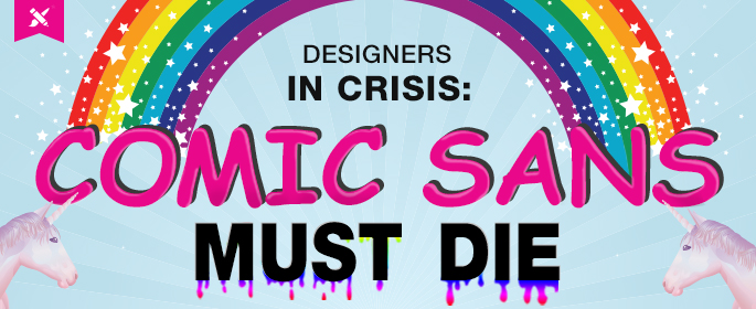
It is a revolution against our greatest enemy. It is a revolution against Comic Sans.
Let’s back up for a moment.
Computers.
Computers are a wonderful thing, and they have come a long way. Our machines have evolved from that little tan Macintosh that sat on your counter; to the first colorful bubble iMac; to laptops; to the smart phones and tablets of today. It may seem archaic now that our computers once served only to help us write documents, play Solitaire, or connect us to our AOL Chat windows, but don’t forget, our font library was equally sad.
In the early days, our font choice was limited to a total of 10 fonts consisting of typical, average serif and sans serif fonts (aka – the Helveticas and Times New Romans). It was the equivalent of the design Dark Ages. And who has been with us since the very beginning? It was our frenemy, of course, Comic Sans.
Comic Sans stood out as a unique, crafty, fun, catchy, cutesy font… yes, I said cutesy. Like that little riddle, ‘Which one of these is not like the other’ – it drew attention and caught your eye because it simply didn’t look like the others. When you needed to create a flyer, a birthday card, or if you were writing your college thesis, you did it using Comic Sans. It made the project ‘POP’ and get noticed.
Then it got overused. Everywhere. On everything.
Fast forward to now.
Technology has evolved, which has allowed computers to follow suit and the programs we use to cater to our every need. Today our machines connect, empower and transform our lives in far more exciting ways. They’ve seen tremendous growth and evolution.
So why hasn’t our font library matured with it?
Let’s be real: You wouldn’t be caught dead in your mom’s bright purple, floral bell bottoms, or your dad’s red and yellow plaid highwater pants. So why are you still using Comic Sans? It’s old, outdated, and, well, it’s also kinda ugly.
Your customers are visual people. When they see your product packaging, your catalog, signage, or your commercial they’re making immediate assumptions about your business before they’ve even interacted with it. And they’re making that decision about you based off what your marketing looks like and the message you’re giving off. You want to make sure you’re giving off the right one. You want customers to see you as the trusted professional and the best choice for meeting their needs. Whether you’re a small business entrepreneur or established fortune 500 national company – your appearance is everything in conveying the right message to your audience.
If you’re still using Comic Sans, or any other cutesy, outdated font, it’s time for a brand makeover.
Do yourself a favor, before 2013 hits do an audit of your existing marketing materials.
What works?
What doesn’t work?
What message are you giving you off?
What message do you WANT to give off?
As a business owner, take the passion you have for your business and put it into your marketing – be unique, think outside the box, and sketch it up. In the business world, you are never ‘done’. You always have to be implementing and keeping your business up to date and running successfully. Today’s economy is tough for all businesses large and small – but that doesn’t mean your marketing initiatives have to suffer. Be on the lookout for ways your brand can evolve and change for the better.
As I walk through the store, see bulk mailers, catalogs, websites, billboards, TV commercials, business cards, signage, packaging, apparel- I am continually haunted by the continued use of Comic Sans, that dated, overused, cutesy font from 1995. It’s 2012, just days away from ‘the end of the world’.
No offense Comic Sans, but am I really going out looking at you?!
Be better than that. Delete this archaic font from your library and walk with me with into the 21st century.
Together, we can kill Comic Sans.


