Happy GIS Day!
Today is GIS Day, an annual day dedicated to the importance and value of Geographical Information Systems, or GIS. GIS is a type of mapping and data analysis technology that facilitates problem-solving of all types. It combines traditional cartography and map-making capabilities with data enrichment and analysis functions.
From guiding business decisions to supporting governmental agencies to cutting-edge academic research, GIS is used throughout the world to solve problems in which “where” matters. ESRI, an industry leader in GIS and the vendor for the popular ArcGIS software platform, uses the tagline “The Science of Where”, and the description couldn’t be more fitting. ESRI launched GIS Day all the way back in 1999 and this year marks the 27th celebration of everything GIS related.
In marketing campaigns, there’s almost always a “who” and a “what” component – what products or services you are marketing and to whom. But sometimes “where” is just as critical of a consideration, and in these situations, GIS software and processes can step-in and fill a vital role in an organization’s overall data infrastructure.
To help celebrate GIS Day this year, Overit decided to come up with a fun and hypothetical work project, make some cool maps, and show you how GIS capabilities can inform marketing and business operations decisions for companies. Are you ready?
The Concept: Scout and Choose a Location for an Overit Indoor Pickleball Court
For our hypothetical work project, Overit decided we’re going to join the millions of Americans who are discovering the fun and thrill of pickleball. We’re going to open up our own indoor pickleball court!
If you’re not familiar, pickleball is a sport not entirely dissimilar to tennis or perhaps badminton, but with smaller courts and paddles instead of full-sized rackets. As of GIS Day 2025, it is America’s fastest growing sport for the last 4 consecutive years. According to the website Pickleheads, industry reports suggest that there are now 20-40 million pickleball players in the United States, an over 200% increase in the last 2-3 years. Pickleheads maintains a database of known pickleball courts, with nearly 70,000 locations across the country.
For this project, Overit was tasked with finding a suitable location for an indoor pickleball court in the greater Capital Region, NY – where Overit offices are located. We used ESRI’s proprietary ArcGIS platform and mixture of available 3rd party dataset to do so. This type of exercise is known as a Suitability Analysis, and it’s a quite common use case for marketing and business intelligence. Whenever a brand needs to decide where to open up their next store, or a new market to break into, Suitability Analysis helps guide and inform that decision making process.
Project Setup: The Geographical Restraints for the Suitability Analysis
The greater Capital Region in New York, where the Overit office is located, extends from a little bit south of Albany, NY and extends as far north as the Queensbury/Glens Falls region. This covers or includes parts of 8 different New York State counties: Albany, Schenectady, Rensselaer, Saratoga, Warren, Washington, Columbia and Greene counties.
The first restraint for the project was that the location of the pickleball court needed to be somewhere within this broad area. The NYS Thruway/I-87 highway runs north to south directly through this area and serves as a key reference point. We wanted to make sure our pickleball friends and customers could easily get to our indoor facility, so we didn’t want to stray too far away from that road in either the east or west direction.
But from south of Albany to the Glens Falls area is still an over 65-mile stretch on I-87. That’s a lot of area to cover! We decided we’re going to first pick 3 initial “seed” spots up and down the Capital Region. We chose Ravena, NY as the southern location, Clifton Park, NY as the middle location, and Glens Falls, NY as the northern location. We used a Drive Time radius/buffer tool within our software and defined the areas that are no more than a 20 minute drive time from each of those initial locations. You can see in our first map below what this looks like:
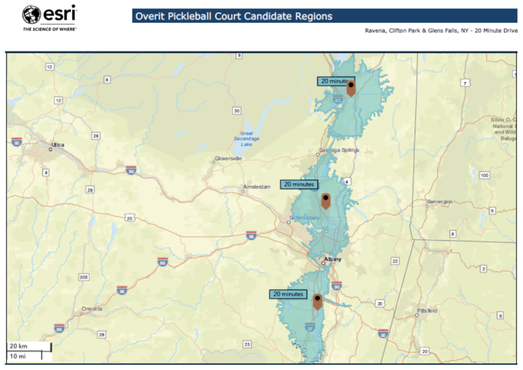
We have 3 pins for our initial location setups and defined 20 minute drive time areas for each. You can see that this creates 3 distinct zones stacked on top of one another with very minimal overlap.
Already, we’re getting excited! The future home of our pickleball court is going to be somewhere very close to, if not fully within, one of these 3 zones. The only question is which zone, and where in that zone?
Competitor Analysis: Adding Existing Pickleball Court Locations
The next step for our project was to start mapping out the locations for known pickleball court locations. Overit went to a neat website for local pickleball enthusiasts called 518Pickelball. This site maintains a list and map of known pickleball courts throughout the greater Capital Region.
Pickleball courts are found in both indoor and outdoor locations. But because it can get quite cold out in the greater Capital Region, we wanted to focus on Indoor courts. That way, our future pickleball fans and customers could use our indoor court facility all year round. We entered the indoor court information into a .csv spreadsheet, including the physical address of the court. We uploaded that dataset into ArcGIS and created a new layer to our map. You can see in the next map below what this looks like:
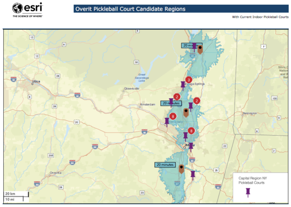
Overit mapped out 26 different locations for indoor pickleball courts that already exist in the Capital Region. You can see some individual spots in the map above. For areas like Schenectady and Albany, you can see a number (like 8) in a red circle. These red circles and numbers indicate that if we were to zoom-in closer, 8 distinct pins would appear. But at this high-level coverage and resolution, we just see all of them represented with a single pin for now.
Still, we can already glean some meaningful insights. Most of the current indoor pickleball courts are found within or near our middle region. Hmmm. There doesn’t seem to be anywhere near as many courts in the north or south most regions. Between Saratoga Springs, NY and Glens Falls, NY, there was just one indoor pickleball court. From Albany NY to south of Ravena, NY, there was also just one indoor pickleball court, and it was actually located east of the 20 minute drive time zone.
Might one of these 2 zones be where we should open the pickleball court? Maybe! We’ll have to dig in a little deeper and continue our analysis.
Market Research: Adding in Market Potential Indexes and Data
The next step of our analysis was to assume that interest in pickleball as a sport is NOT uniformly distributed throughout the greater Capital Region. Some areas will have people who want to play more than others. We wanted to gauge the local interest in the sport and start mapping it to our 3 main candidate regions/zones.
To do that, we leveraged some proprietary Market Potential datasets that are built-directly into ArcGIS. These are developed and maintained by ERSI, along with some industry leaders in Market Research like MRI-Simmons. These datasets cover a tremendous range of potential consumer spending habits, preferences, and interests. Sports and leisure make up an entire subcategory of these Market Potential datasets, so we were confident we’d find something useful to inform our analysis.
We used the dataset browser built into ArcGIS and actually found a dataset called “Played Pickleball in Last 12 Months”. Well, that sure seems relevant! This dataset is available as a raw “count” of people for a geographical region OR as a Market Potential Index (MPI). An MPI standardizes the national median for the dataset to 100,with a score of 120 representing 20% greater results than the national median. So any score above 100 means above-average interest in pickleball and a score below 100 means below-average interest in the sport.
Finally, we used “heat-mapping” features, where visual elements such as color or size represent geographical differences for that data. We chose color and mapped the MPIs on a Yellow-to-Green scale, where lighter and more yellow regions are less interested in pickleball and the darker and more green regions are more interested in it. You can see what this looks like in the next map below:
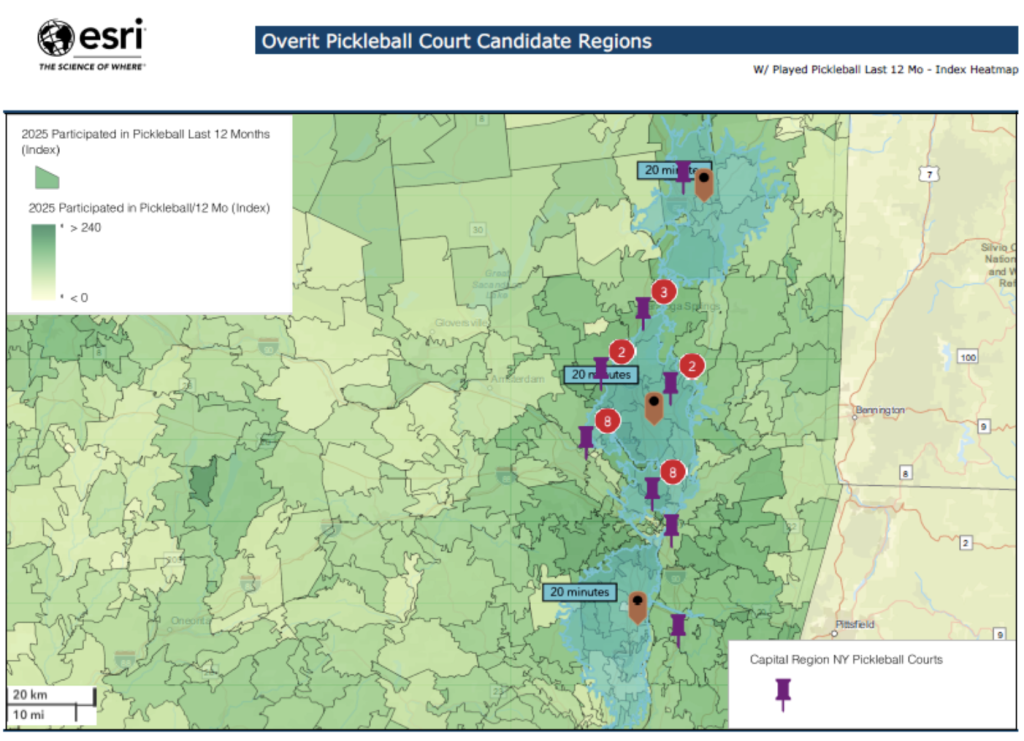
We chose to heatmap to the zip code level, so each of the many little sub-regions in the map above represent a distinct zip code within or near the greater Capital Region. The lighter/yellow regions represent zip codes with less interest in pickleball. The darker/green regions represent zip codes with the most interest in pickleball.
Now we’re starting to make some real progress in the overall analysis. Our ideal location would be someplace that isn’t already too close to an existing pickleball court AND has above-average interest in the sport as measured by the market potential index.
Tying It All Together: Running a Suitability Analysis
The last phase of the project is where the real “magic” occurred. Rather than hunting and pecking through multiple map layers to find court coverage gaps AND above-average interest in the sport, we tasked ArcGIS with running an in-platform Suitability Analysis according to 3 weighted criteria.
We used proximity to an existing pickleball courts as negative/inverse criteria and set-up the Played Pickleball in Last 12 Months MPI as a positive criteria. These were the 2 most heavily weighted criteria for the Suitability Analysis. Finally, because some areas within the greater Capital Region are more populated than others, we used Population Density from the most Census Reports to serve as lower-weighted criteria and an effective tie-breaker. Given two zip codes that are similar in profile for distance from existing courts and market potential, we told ArcGIS to lean slightly toward the more densely populated one, so as to have more potential pickleball fans to attract.
And that was it! We had ArcGIS run the suitability analysis and score each zip code in the 8 Capital Region counties on a scale from 0 to 100. The higher the overall score, the more suitable the location. We used a very distinct Red-to-Green scale to heatmap the suitability scores. You can see the final results of the Suitability Analysis in the next map below:
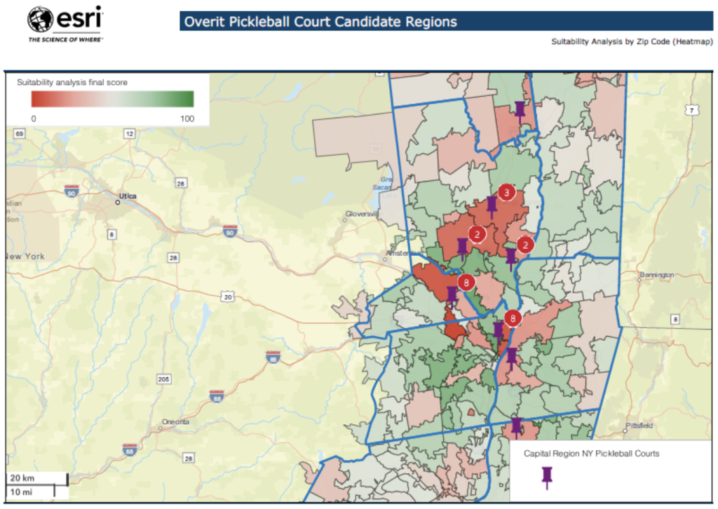
Wow! Some zip codes are very red, meaning due to a combination of proximity to existing courts and market potential, they are NOT ideal locations for Overit’s future indoor pickleball court. Others are green, but somewhat lighter green, meaning they’re about average in terms of suitability score. The darkest green regions represent the most ideal locations for Overit’s indoor court.
Once again, with the built-in capabilities of the ArcGIS platform, we don’t have to hunt for the most desirable zip codes: they prepare and show them directly to you:
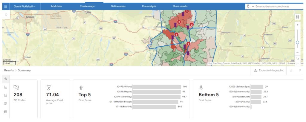
Here we can see our Suitability Analysis map in the upper ribbon, and a Summary of the analysis in the lower ribbon. The tool indicates it ran the analysis on over 200+ zip codes, and the average score came back with a score just over 70. The very Top 5 and Bottom 5 zip codes are automatically identified and displayed. The top 5 zip codes identified had Suitability scores ranging from 90-100. Now we’re getting very close to finding the future home for Overit’s pickleball court!
Stay tuned for Part 2 of this blog, when we pick a winner and dig into key demographic data for the purposes of a marketing campaign to promote the location.